
ON THIS SONG, MIKE EDEL TEELS THE STORY about a pitcher in a small town, who is pitching a perfect game into the 9th inning until his mom runs onto the mound with some harsh news.
IN MIKE’S WORDS: ”The baseball diamonds, and the hockey rinks and the community centers are the theaters where life takes place for these people. They are the stages that hold the metaphors for the joys and the tragedy's of simple life.”
↑
CREATIVE DIRECTION
CHARACTER DESIGN
ANIMATION DIRECTION
ANIMATION


INSPIRATION & REFERENCES
This is a song about baseball and my best references/memories about baseball were the dog scene from 'the sandlot' and 'goofy's how to play baseball' short, which doesn't really help to understand the game. with that little knowledge about the game, I had the first lunch with Jorge and Mike, where they started to clarify the game rules, making the lyrics much more clear. the game itself and its rules seemed cool but, what really caught me was the second layer of ideas that Mike was bringing up. The story about these characters is an amazing and beautiful metaphor about unpredictable events, which shape who we are.
I'm very thankful Jorge brought me for this project since the earlier stages so I had the chance to bring some references, think about the mood and feel for each part of the song and the best shots to achieve that mood. These concepts and ideas were then finished and improved in a storyboard/animatic by Cesar and Arm, who were also responsible for the beautiful Art and the amazing Composite, respectively. At this point I was about to finish the character design and with the animatic done I was able to start to think about the animation and the best way to approach it. That was when Breno joined the team, bringing a great help to finish all the animation in time. when everyone pushes each other bar in a team, that's when the magic truly happens! And it definitely happened with this project in all its stages. A truly cool collaborative experience!
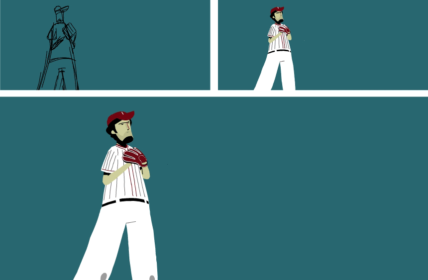
CHARACTER DESIGN
Mike had a clear idea of how he wanted the piece to feel: "I feel that this video should have more of an adult feel, not like Saturday morning cartoons that are super jumpy, bouncy and happy". that helped a lot to bring the character design to a more adult look, which was different from other things I had done before. By my Goofy reference above you can see he was probably right.
We had the idea to go very minimal and clear with the style, so I chose to go for simple shapes that would match this concept (and would also be easy to work with). The two things I liked since the first sketches were the cap's shapes and how graphic the uniform could look with the straight lines. The part I struggle more with, was to find the appropriate head shape and its facial features. They should look less cartoony, yet with an unique and appealing design to it, not just 'realistic' as a real human head. With that in mind the sketches below were made:


once the character's shapes and the facial features started to get somewhere, we started playing with colours and styles. we wanted to play a lot with negative spaces, making some parts of the characters disappear against some parts of the background. And finally, the change that actually made the design hit the spot, putting the characters in a more adult and serious mood, was to draw them with actual human proportions (or very close to it). And so the characters were done and a realization was made: “wow, I draw HUGE heads!”

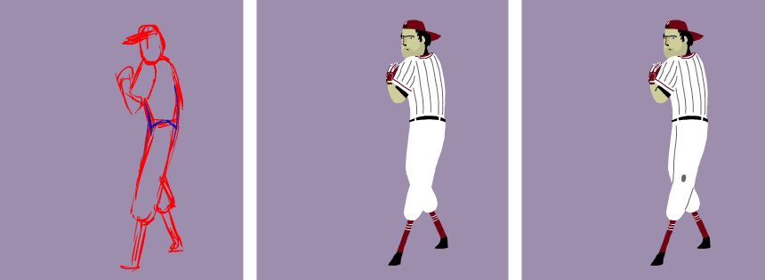
ANIMATION
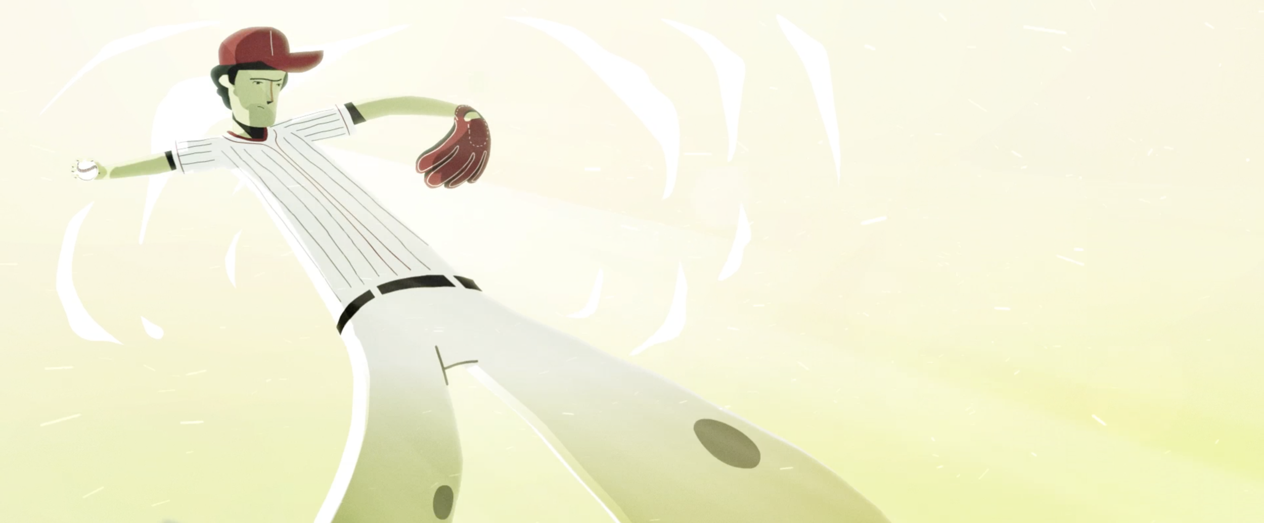
With the characters done it was time to jump on the animation. My first thought was to go all traditional, doing it all frame-by-frame, but with the schedule we had ahead of us, it soon felt a bit crazy. The solution was then to bring as much as possible of this look and feel to a more production friendly approach, which involved having the characters broke up into pieces [symbols] and use them based on a traditionally drawn rough guide. Some of the very last details such as the little lines in the arms and legs connections were then drawn frame by frame to help to enhance to traditional look. Best case scenario, most of the scenes would definitely look frame-by-frame, especially the action scenes with the Pitcher, Closer and Batter. It was a very good opportunity to find that sweet spot between art and production that makes a project flow nicely.
But the most challenging scenes were the acting shots. The lyrics has some very deep and touching moments and, of course, the animation needed to match those. Personally, it's always easier to do a cool jump/run/kick thingy than to convey that a character is thinking and feeling. Those are the moments were subtle eyes movements, blinks, small briefing moments and pauses come to play a huge role. At the end, I'm very happy about how the Mom/Pitcher scenes turned out and also the whole Coach's dramatic arc.


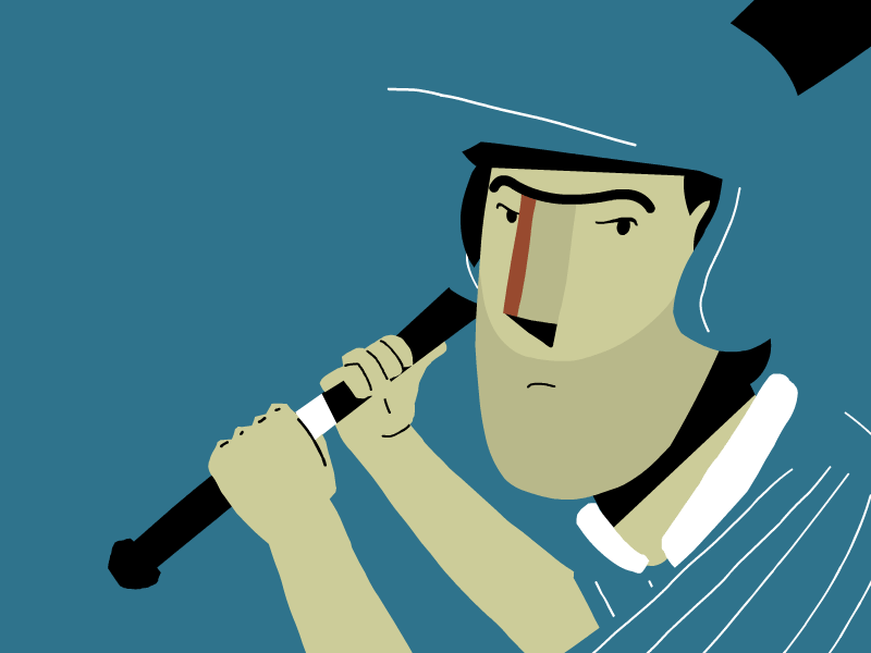
FINISHED FRAMES


CREDITS
MUSIC by Mike Edel
PRODUCTION. Jorge Canedo Estrada
CREATIVE DIRECTION. Mike Edel, Jorge Canedo Estrada, Henrique Barone
ART DIRECTION | LAYOUT | STORYBOARD. Cesar 'El Diablo' Martinez
STORYBOARD | COMPOSITING. Arm Sattavorn
CHARACTER DESIGN. Henrique Barone
CHARACTER ANIMATION. Henrique Barone and Breno Licursi